Gardaland - website redesign
Analysis of the current website and redesign proposal.
PROJECT TYPOLOGY
University project,
Politecnico di Milano,
Group project
BRIEF CUSTOMER
University course:
Ergonomics applied to
the design of usable
web pages and apps
PROJECT DURATION
Sep. 2023 - Jan. 2024
SERVICE AND OFFER
Redesign
Design System
Wireframing
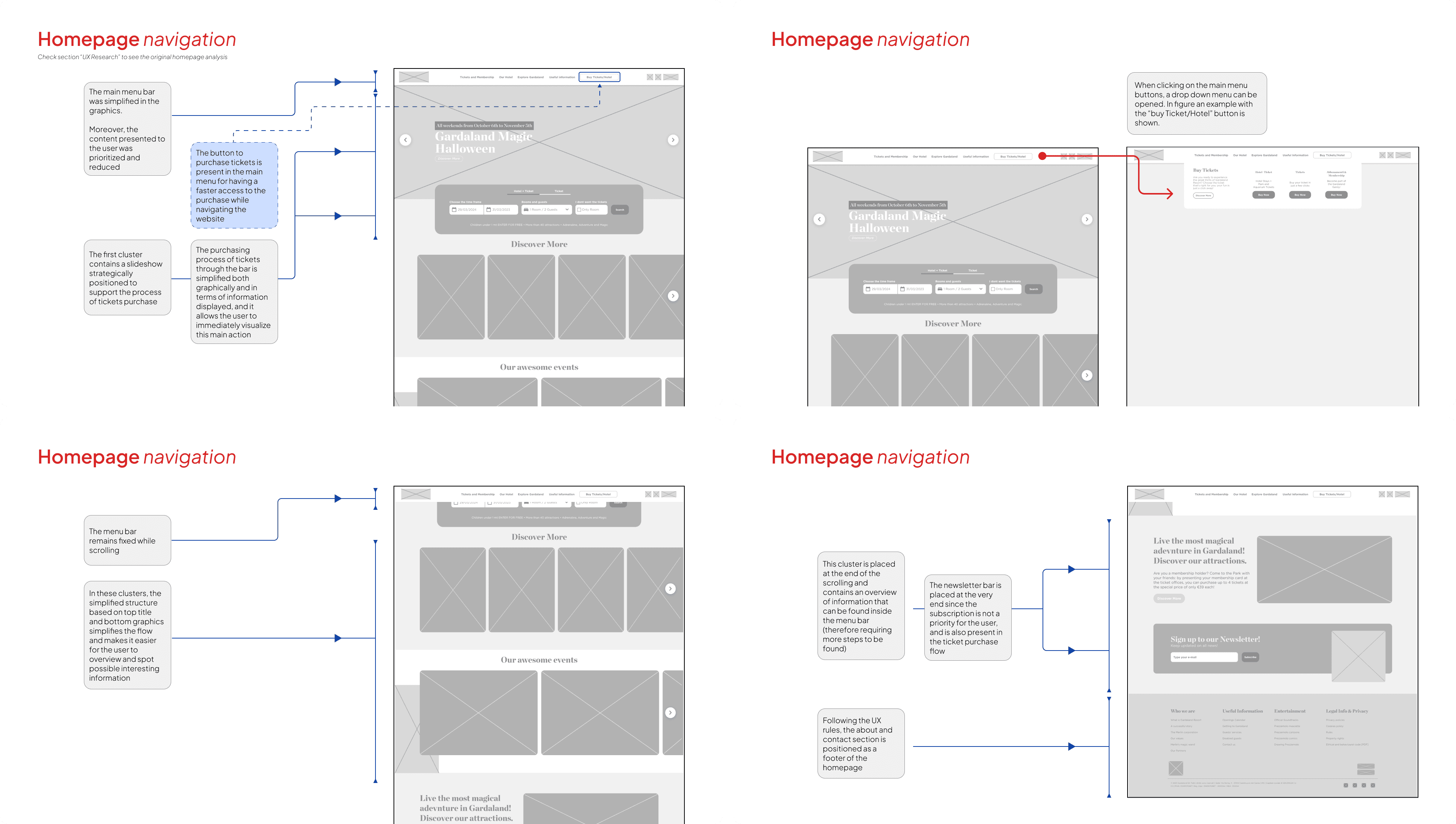
PROBLEM
The current Gardaland website suffers from a cluttered layout, inconsistent navigation, and a lack of clear focus on key offerings. Users struggle with chaotic information presentation and repetitive content.
SOLUTION
After a detailed site analysis based on Nielsen heuristics, we proposed a streamlined redesign that emphasises intuitive navigation, reduces menu clutter and presents a cohesive layout. This approach will improve the user experience by making key information more accessible and engaging.
VALUE DELIVERED
The redesigned website will provide a cleaner, more organized interface, improving user satisfaction and efficiency. Visitors will find information quickly and easily, leading to increased engagement and conversion rates.
WEBSITE GEERAL INFO /Source: https://www.similarweb.com/website/gardaland.it/#traffic
WEBSITE ANALYSIS
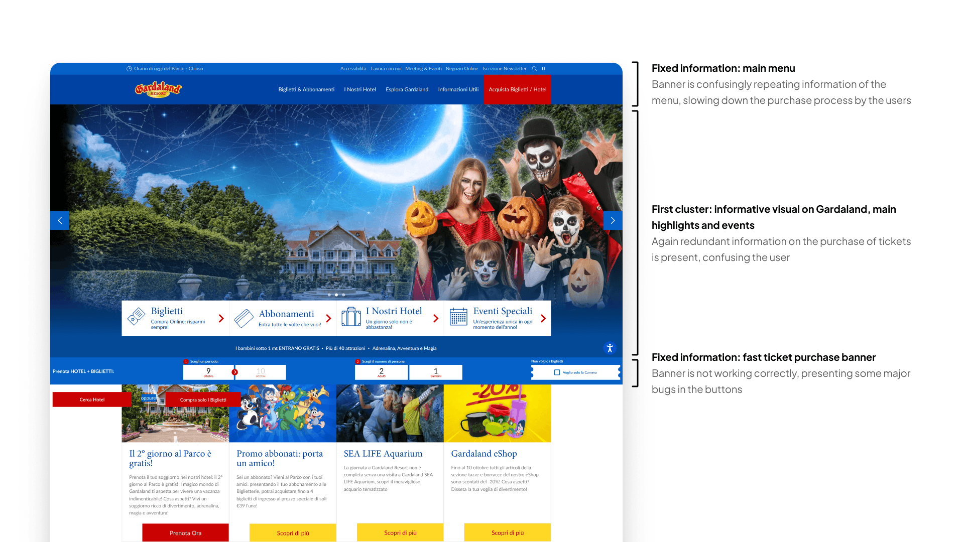
Homepage
We conducted an analysis of the website, focusing primarily on the homepage, using Nielsen's heuristics.
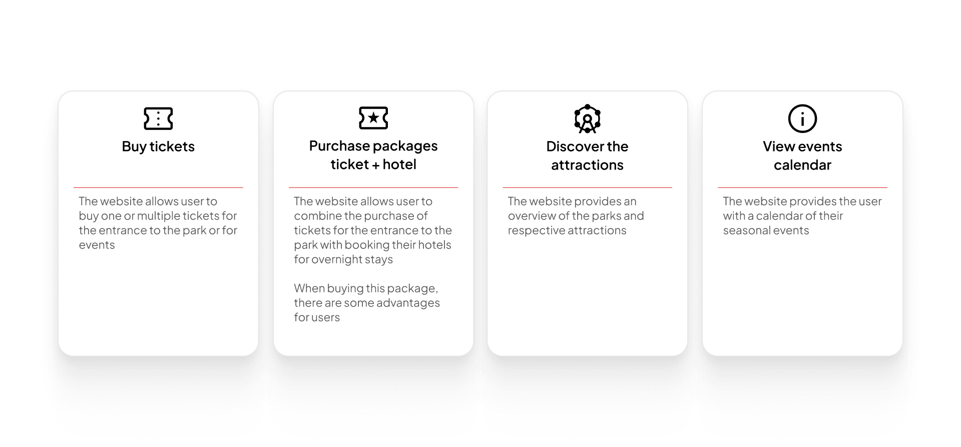
Website main offer
We then identified the site's key offerings, prioritizing what was most important and what was less significant.
BENCHMARK: CASE STUDIES
UX RESEARCH
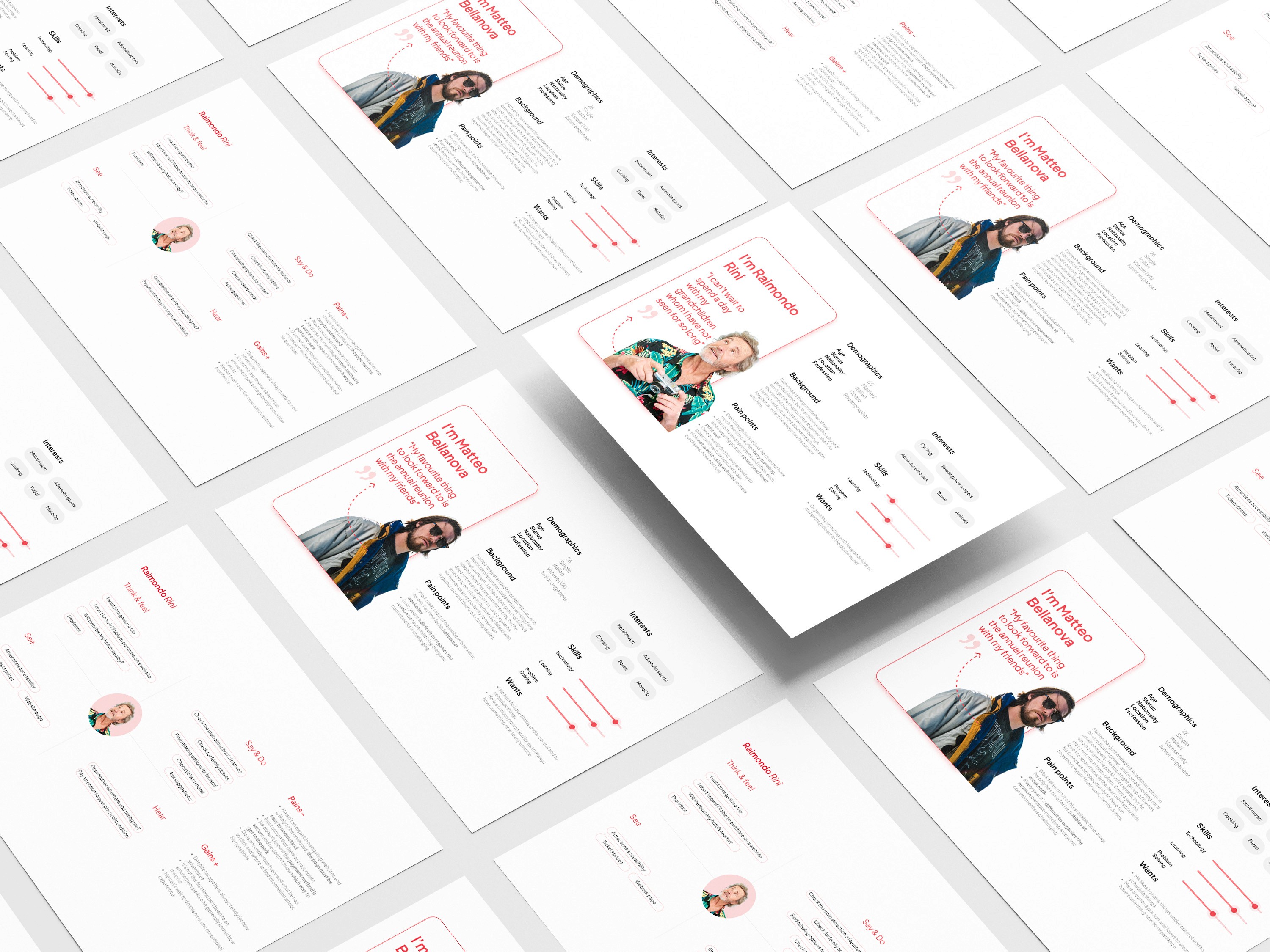
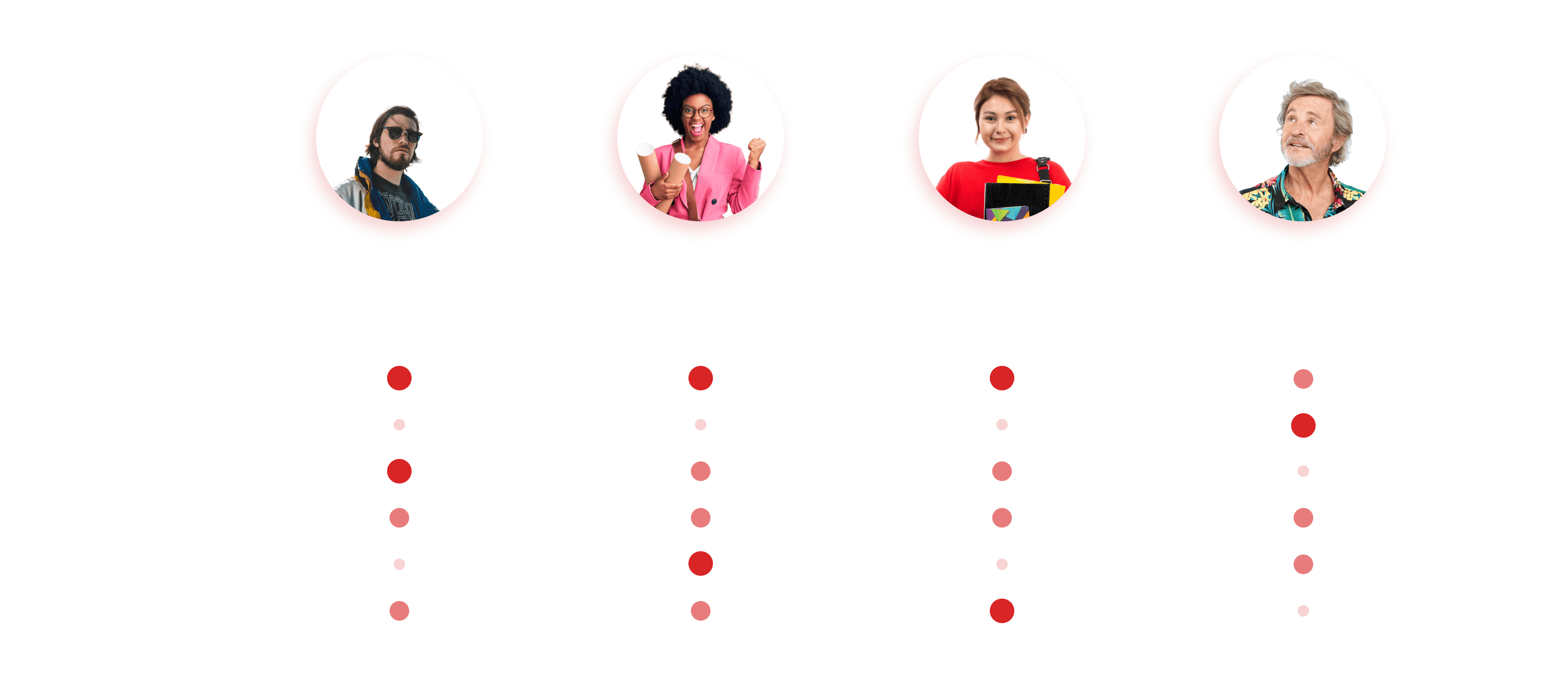
Personas & Empathy Map
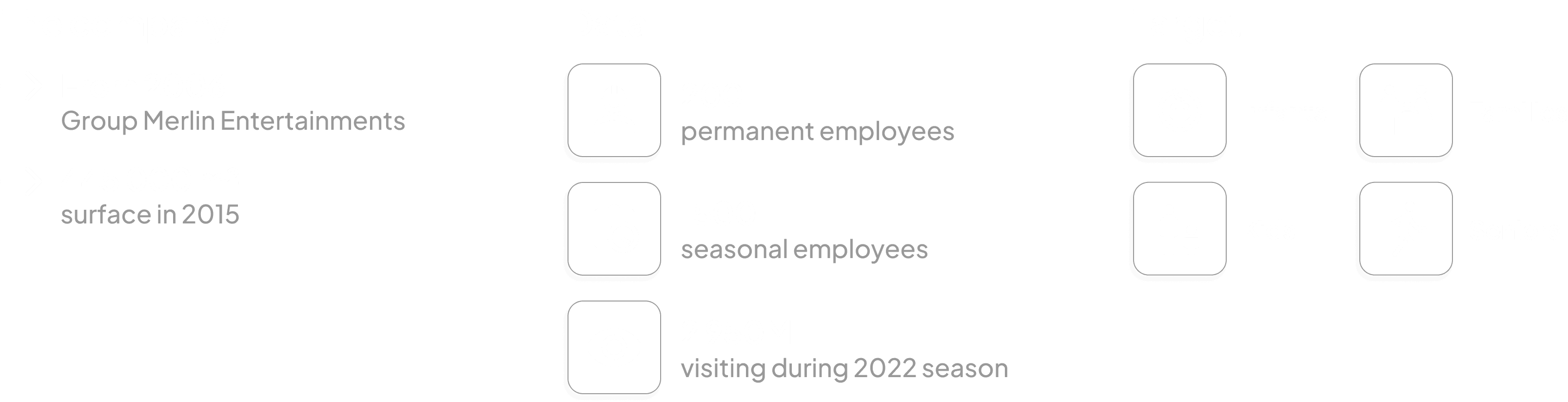
We conducted an analysis of four personas on the usability of the Gardaland website, along with their corresponding empathy maps.
TASK MATRIX
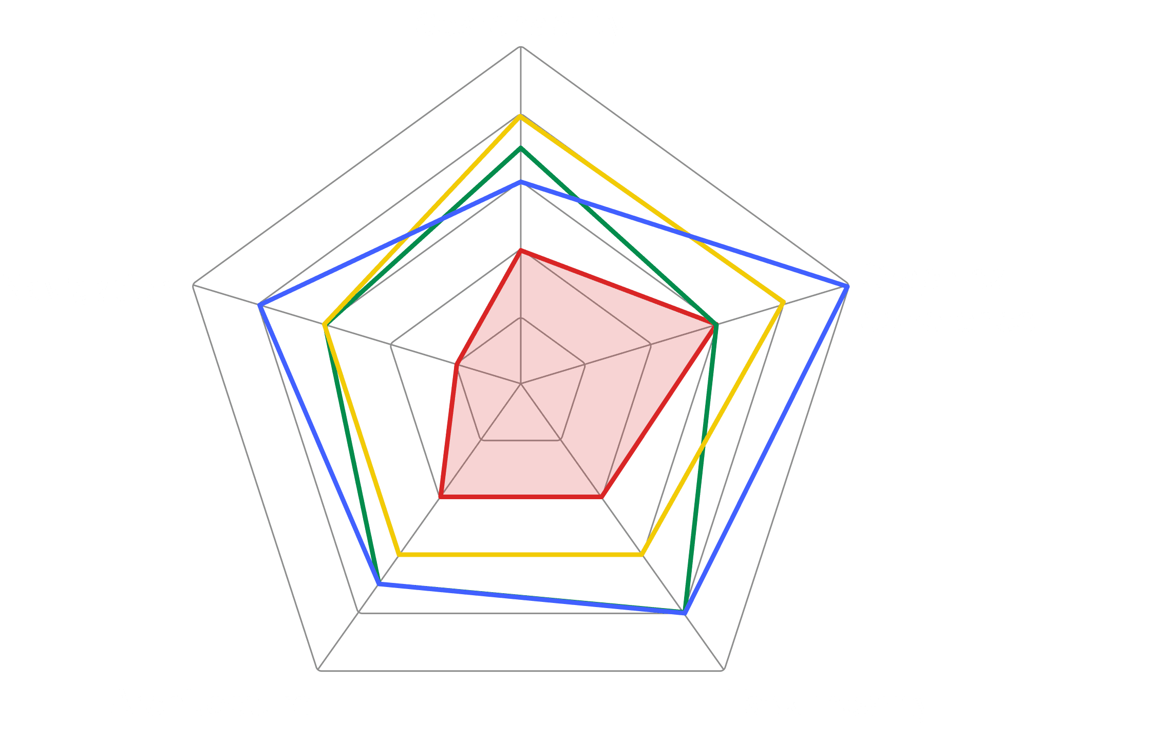
Website evaluation: comparison
After evaluating the websites based on Nielsen's heuristics according to the main tasks performed by each persona, and considering the pages visited and clicks required to complete the actions, we conducted a final overall assessment. Disneyland stands out for design and navigation, Caneva World for searchability, Mirabilandia balances well, and Gardaland needs significant improvements in several areas.
INFORMATION ARCHITECTURE
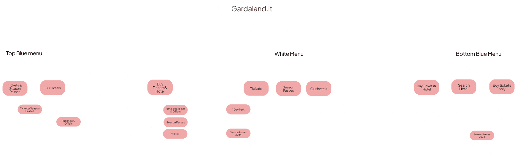
Old information architecture
Chaotic layout, repetitive content, and poor element placement.
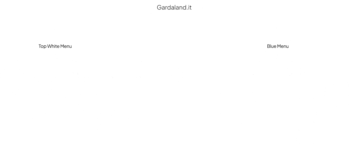
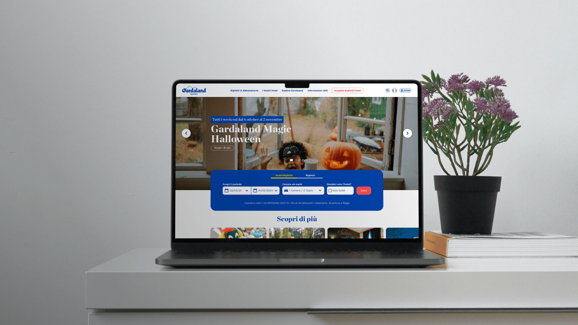
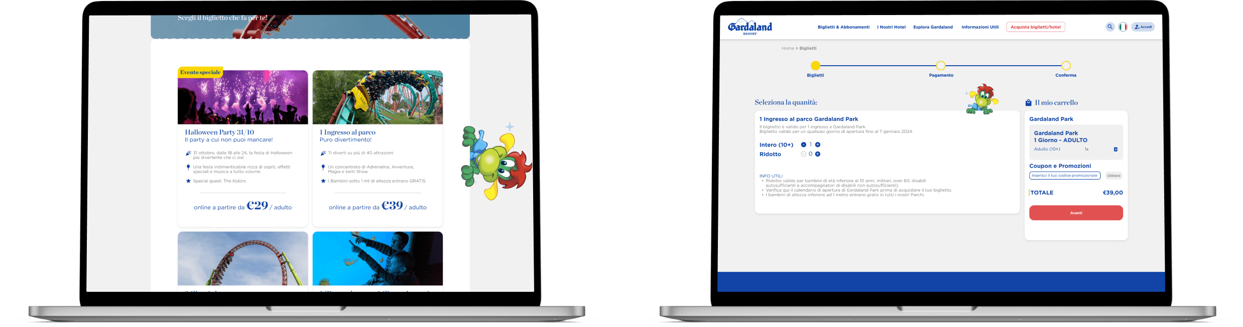
New information architecture
Fewer menus, predictable placement, and intuitive design.
WIREFRAME
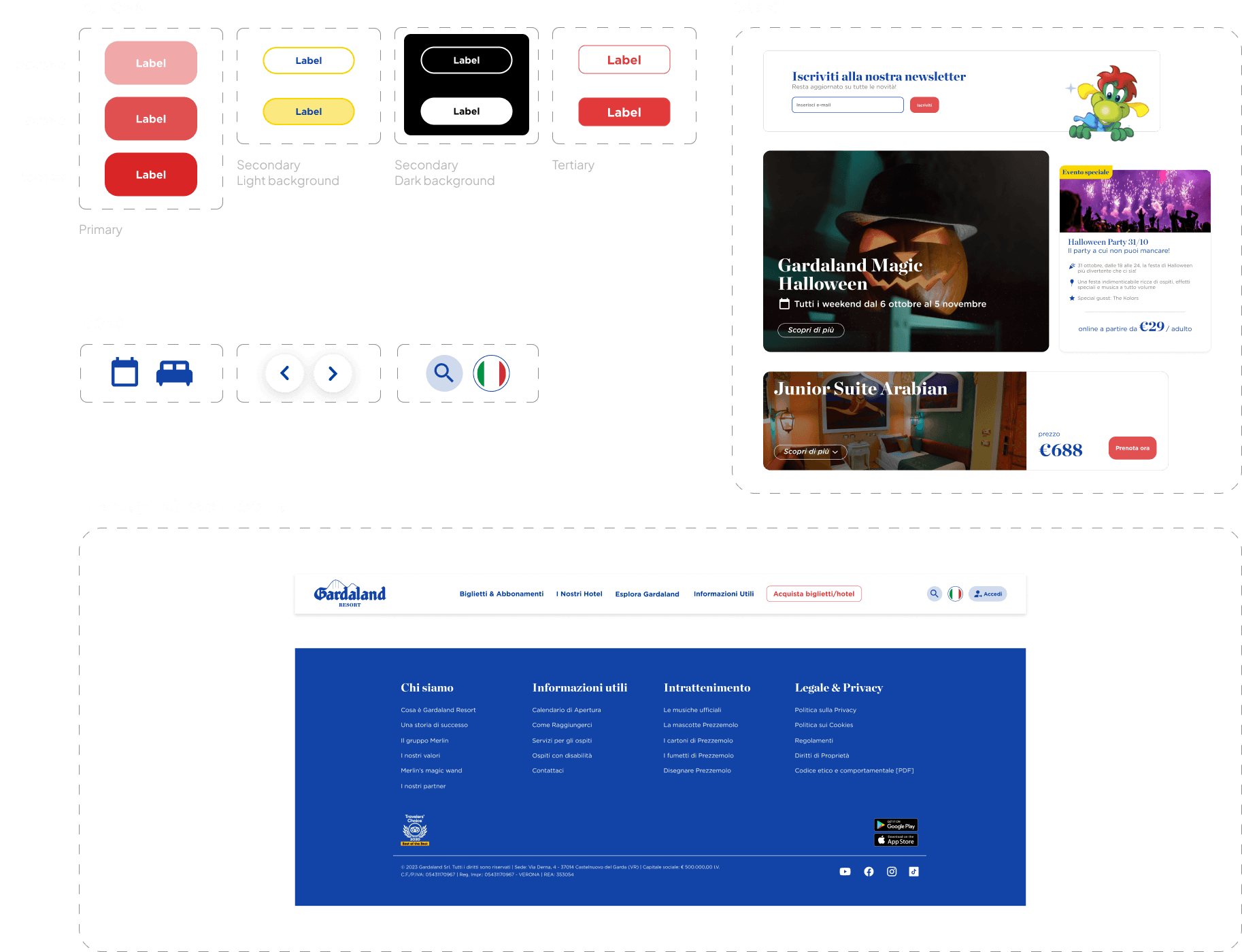
DESIGN SYSTEM